Helvetica: 60 Years of Swiss Design Influence
Delve into the revolutionary Swiss design and the iconic Helvetica typeface, celebrating six decades of its profound impact on graphic design and visual communication.
Peter Hulm·

Delve into the revolutionary Swiss design and the iconic Helvetica typeface, celebrating six decades of its profound impact on graphic design and visual communication.
“The Swiss were good,” admits the authoritative design magazine Print. What it meant was the post-1945 artistic movement from Switzerland launched as Die Neue Graphik and later dubbed Swiss Style.
Swiss Style’s principles of simplicity, readability and rationality dominated late 20th-century graphics. You can see them at work everywhere on the web. For example, see the Print website:

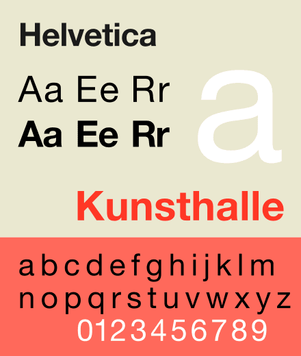
Today the innovative approach to graphics, rejecting ornamentation and embracing photography, is known as International Typographic Style or Swiss Style. This year sees the 60th anniversary of its most famous, ubiquitous and influential product: the typeface Helvetica.
The principles seem all about plain-faced elegance. But professor Steven Heller, winner of the 2011 Smithsonian National Design Award, writes in the Print article: “It took me decades to come to a full appreciation of Swiss ingenuity.” You can find the influence of early 20th-century Bauhaus and de Stijl in the lack of extraneous embellishment in Die Neue Graphik (the ph rather than f in Graphik gives away its Swiss rather than German origins).

But what makes Swiss Style so distinctive is not so much its marvellous sans-serif typefaces (almost a religious requirement) as the rectilinear grid system it introduced for layouts and (what still has to be adopted across the web) asymmetrical design.

The three elements together — superbly drawn sans-serif typefaces, rectilinear grids to hold pages in balance, and asymmetry — made the Swiss Style instantly recognizable despite its surface simplicity.

A young Swiss, Peter Knapp(born on 5 June 1931), transformed French magazine style in the 1960s with his 14-strong team of designers for Elle, including the photographer David Hamilton (LINK). In his history of Graphic Design, Richard Hollis says “Swiss designers like Knapp had received a disciplined training and were used to technical standards unknown in France.” The son of a baker in the canton of Zurich, Knapp moved to Paris after secondary school in Switzerland, signed up at the Ecole des Beaux-Arts, and worked for the artistic director of the Galéries Lafayette. In 1960 he moved to New York and made the acquaintance of the artists Robert Rauschenberg and Barnett Newman, who encouraged his painting. He returned to Paris in 1974. Knapp became famous as a Pirelli calendar designer and photographer for the couturiers Emanuel Ungaro and André Courrèges. He later worked on the design of Fortune, Stern, The Sunday Times and Vogue. With Dancing in the Streets, La Cité de La Mode et du Design in Paris commemorated his 1960-1970 work through an exhibition in 2018 (LINK).
Knapp’s successor at Galeries Lafayette in 1959 was also Swiss, Jean Widmer, born on 31 March 1929 in Frauenfeld. Widmer studied with Knapp and Adrian Frutiger in Zurich, then moved to Paris to continue his studies at the Beaux-Arts. Widmer later became the art editor of Jardin des Modes, where he employed Terence Donovan and Helmut Newton, giving a start to beginners like Topor, and designed the 1974 logo for the Centre Pompidou.

You’ve probably seen his other work most often on French road signs with text and icons designed to be read at speed.
In 1969 Widmer was the first designer to develop a corporate identity system for a French cultural institution, developing the graphic communication of the CCI—Centre de Création Industrielle (Center of Industrial Creation). The website hypocritedesign writes: “It was during this period that Widmer developed his own original graphic language, based on synthesis, rigorous geometry, and schematic typography that to this day represents the first and one of the few examples of Modern graphic design in France” (LINK).
Le Cercle d’amis Jean Widmer at Fribourg University offers a CHF5,000 Jean Widmer award for an article in the social sciences, published by a young researcher, that makes a significant contribution to the study of communication and the public sphere (LINK).

Adrian Frutiger (1928-2015), born in Unterseen (Bern), the son of a weaver, worked mainly in Paris but left his complete work to the Zurich Museum für Gestaltung/Museum for Design, and lived mainly in Bremgarten (Bern), where he died.
Starting out as a compositor to an Interlaken printer at 16, he studied later in Zurich, concentrating on calligraphy. He was hired by a Paris foundry, largely on the quality of his wood-engraved illustrations to his final Zurich University of the Arts (Kunstgewerbeschule) project. He designed several typefaces, including the elegant Méridien, similar to our serif headline type. Working mainly in Paris, he returned to Switzerland later in life. In an interview, Frutiger apparently described himself as a Calvinist.
Part of his work is available to view online (LINK). The museum, which has a total 350,000 posters, staged an exhibition in 2016 entitled “Les Suisses de Paris” including Frutiger’s creations (LINK). Using legibility research as a guide, Frutiger designed the signage for Charles de Gaulle airport and a variation, Frutiger, described by designers as “the best general typeface ever” features on Swiss road signs and Dutch railway stations.
Where did all this come from? Most histories credit Ernst Keller as the father of Swiss design (LINK). Born in Aarau in 1891, he worked in Leipzig until 1914 and joined the Zurich Kunstgewerbeschule (School of Applied Art) in 1918. He died in Zurich in 1968.

A history of graphic design in advertising says of Keller: “He taught that design should be adapted to the content and began experimenting with grid systems which are an integral part of the idealized design style that is popular today.” Another notes: “His teaching activity starting in 1918 can be defined as one of the first systematic training programmes for graphic design in the world.” The main study of his work and influence, published in November 2017 as No Style, says the diversity of his pupils “is an impressive documentation of the openness, sustainability and rejection of dogma evident in Ernst Keller’s teaching” (LINK).
The Swiss Style became particularly associated with Josef Müller-Brockmann at the Zurich School, who presented the core of Keller’s ideas in a book on grid systems, and Armin Hofmann at the Basel School of Design.
Hofmann, born on 29 June 1920, taught in Philadelphia and Yale in the 1950s. Armin was also a sculptor and stage designer. He founded the Basel school in 1947 and his principles are still taught there, reports Callie Budrick in a Print article on the Swiss Style. The Zurich Museum of Design has a small selection of his work on show until 5 July 2020 to mark his 100th birthday (LINK).
The Museum notes: “In 1965 he wrote the Graphic Design Manual, which is regarded as a fundamental work in the field of modern graphic design and art.”

In 1958 Müller-Brockmann helped launch a trilingual magazine entitled Neue Grafik (with an f). The second issue introduced Adrian Frutiger’s Univers typeface, designed especially for film-setting of type. Its 18 issues are available together for €250 (LINK).
Callie Budrick writes that Univers was “one of the first typefaces that formed a font family, allowing documents to use one typeface (instead of several) in various sizes and weights”.
Wikipedia records: “Central to the journal was the conception of the designer as an individual endowed with a great deal of social responsibility. With the authority to effectively communicate ideas, the founders held, came responsibility to uphold values and justice. The journal was also known for advocating the use of photography as a central element in graphic design” (LINK).
Typically for Switzerland, the innovation did not go down well with the establishment. One historian observes: “The publication was decried by a number of critics, particularly in Zurich, who characterized the International Typographic Style as rigid and cold.”
Apart from Univers, Frutiger also produced Avenir and many other typefaces. As a schoolboy he had invented his own stylized handwriting in opposition to the formal cursive handwriting required in Swiss schools (LINK).


Helvetica, “probably the most successful typeface in all of history”, was designed by former salesman Max Miedinger and a double-ff Hoffmann, Eduard, President of the Haas typefoundry (LINK). The font was first known as Neue Haas-Grotesk after the type foundry that commissioned it, with a nod to Akzidenz-Grotesk, the inspiration for all these modern sans-serif types.

“The two men didn’t always agree,” reports Indra Kupferschmid, a typographer and professor at Hochschule der Bildenden Künste Saar, after exploring the history. “Many details were discussed over weeks and modifications would continue until late autumn.”
You can read its history and examine original drafts from 1957 at fontbureau (LINK).
Hoffmann renamed the typeface to the more commercially appealing Helvetica in 1960, rejecting a suggestion of Helvetia, when Linotype introduced a version for large print runs. Helvetica is still the typeface used on U.S. tax forms.

But many of its characteristics needed tweaking to be used by other typesetting machines (hence its multiple variations). Though it was one of the first typefaces to be adapted for digital typesetting, “unfortunately, many of the design limitations from analog systems were carried over to the digital realm,” fontbureau records. “For example, the version of Helvetica that comes with every Macintosh computer today, digitized in the early days of PostScript, still retains the coarse 18-unit width system from the phototype era. Many of its curves lack finesse and its oblique was created by automatically slanting the roman.” (Most other systems use 54 units for widths).
Over the years Helvetica became a “hodgepodge of fonts”, Kupferschmid observes in her history (LINK). Finally, in 2004, 27-year-old U.S. type designer Christian Schwartz was commissioned to design a new version. Completing what he described as a restoration in 2010, Schwartz carefully redrew the typeface to match Miedinger’s original forms. He offered different designs for headlines and text, with variants for some of the headline characters, and case-sensitive numerals and punctuation. Numerals and related symbols all align properly when set in columns.
When he saw the proofs, Eduard Hoffmann’s son Alfred commented “Almost better than the original,” reports Kupferschmid, who adds: “I agree.”


In typography, after the launch of Helvetica, the scene became a battle between Basel (Univers) and Zurich (Neue Haas-Grotesk).

One of the pioneers stands outside this group. Max Bill (1908-1994), born in Winterthur, is best known these days for his architecture and industrial design.

His Ulmer Hocker (Ulm Stool:) is designed to serve as needed as a shelf element, a speaker’s desk, a tablet or a side table. But he was another supporter of the Swiss Style, having studied with Wassily Kandinsky and Paul Klee at the Bauhaus (LINK). His school in Ulm included courses on semiotics, the study of signs and symbols. He is often considered “the most decisive influence on Swiss graphic design”, writes Callie Budrick.
It was to Bill that the most famous anti-Swiss-Style designer referred when rejecting such sobriety.
Wolfgang Weingart (born in 1941 near the Swiss border in Germany), “the most influential younger Swiss designer abroad” according to Hollis, was a teacher at the Basel school. Weingart embraced “spontaneity and deliberate carelessness”, in the words of the American graphics association AIGA (LINK). He defended his approach in one design with this statement: “I think that the relatively high stimulus of such a text is adequate compensation for the low readability”. He received an AIGA award in 2013.

Swiss Style still rules in many design landscapes. Perhaps it’s not surprising that a standard work on grids these days is published by the British-Swiss company Rotovision: André Jute’s Grids: the structure of graphic design (1996).
Lest this seem like a threnody to Swiss design to the exclusion of all else, let me put in a word for the German typographer Herman Zapf (1918-2015), Frutiger’s only real competitor in the field (LINK).
Zapf restricted himself to designing typefaces, rather than promoting a theory of design. But his prolific creations have more variety than any of the Swiss Style stars.
Zapf Dingbats, created in 1977, is only the oddest of his creations. In 1994, music magazine editor David Carson printed an interview with the singer Bryan Ferry entirely in the symbols-only font. The writer said he did it because the interview was “incredibly boring” and decided to use Zapf Dingbats in the hope of making the article interesting again (LINK).

Optima, inspired by Roman lettering after Zapf visited Florence in 1959, though dubbed Pessima by dismissive rival designers at the time, has proved one of the most durable fonts since its introduction in 1958 (LINK). It is used for the Vietnam Veterans Memorial in Washington D.C.
Zapf Chancery, a calligraphic style, has found many uses for jobbing printers who produce greeting cards, invitations and similar materials.
Palatino, released in 1949, has proved even more useful to designers desperate to avoid conventional serif faces. It was designed to read clearly on poor-quality paper (LINK).
Born in Nuremberg, Zapf was sent to Dachau concentration camp for a short time after being involved with trade unions, and could not obtain a student’s place in a technical institute under the Nazi regime. He tried to get an apprenticeship as a lithographer but was asked political questions at each interview and rejected, though he was often complimented on his work. In the end he got a job as a retoucher. Often in ill-health, he became a type designer in 1947. His later work is less in favour among designers, but see the variety of his fonts.
Zapf resigned from the International Typographic Association in 1993 in protest at unauthorized copying of fonts by its members (particularly Monotype which was protected by U.S. rules). Microsoft distributed Monotype’s Palatino clone known as Book Antiqua. Since 2000 Microsoft has distributed Linotype’s version of Zapf’s original design, but Book Antiqua is still
available in Microsoft Office.
Zapf’s students created the Lucida type family designed to appear balanced on computer screens as well as in print. His research into computerized typsetting helped Adobe in its layout software InDesign. His other research is incorporated into OpenType technologies (LINK).
For typography, I think this German proved himself even better than the Swiss.
25 May 2022: Adobe Releases Swiss Graphic Design Poster Template with Geometric Minimalist Shapes and Typography for Illustrator. (LINK)

16 October 2020: Ed Benguiat, a Master of Typography, Is Dead at 92. New York Times (LINK)
Before moving to Switzerland, Peter Hulm worked on newspapers
that won awards for design and reporting in the U.K. He has himself designed
information materials from flyers to books and videos for international
organizations throughout his career.